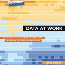
Welcome. This is the companion website for the book Data at Work: Best practices for creating effective charts and information graphics in Microsoft Excel.
Here you’ll find the original Excel files I used in the book. Feel free to download them. Under “The Book” in the menu above there’s a page for each of the chapters, where you’ll find the files, corrections and suggestions and additional resources. I encourage you to use the comments to send feedback, ask me any book-related questions and suggest how the charts could be improved or suggest better ones (in Excel).
I wrote Data at Work with my past self and my former coworkers in mind: people that deal with data on a daily basis, use Excel for everything at average to advanced level (no programming, though), and are not expected to have strong graphic design skills. Also people that often derive their data management, analysis and communication, not from a formal training on those areas, but from Excel and Excel training.
It took me some time finding the sweet spot between theory and practice, and between Excel skills and design skills. I wanted to build a lighthouse (or a safety net, I’m not sure about the right metaphor) that will always be there to guide the readers but always encouraging their own exploration. I know I’m biased, but I like the end result. Hope you’ll like it too.
Enjoy the book!
Jorge Camões
P.S.: “Excel Charts” in the menu above links to my main blog, ExcelCharts.com, where I’ll keep writing.
